introduction
POC EVO is the world's leading Point of Care management software — by number of installations and active users. I was the UX Lead responsible for the end-to-end redesign of the platform.
Client
Andrea Mabellini
Date
Categories
Tags

About the Project
POC testing happens at the patient’s bedside. Accuracy and regulatory compliance are safety-critical.
The challenge: Three disconnected products, an outdated platform, affiliates losing enterprise accounts. The goal: rethink the entire POC platform. 24 months: discovery → design → validation.


My Role & Team
Design team
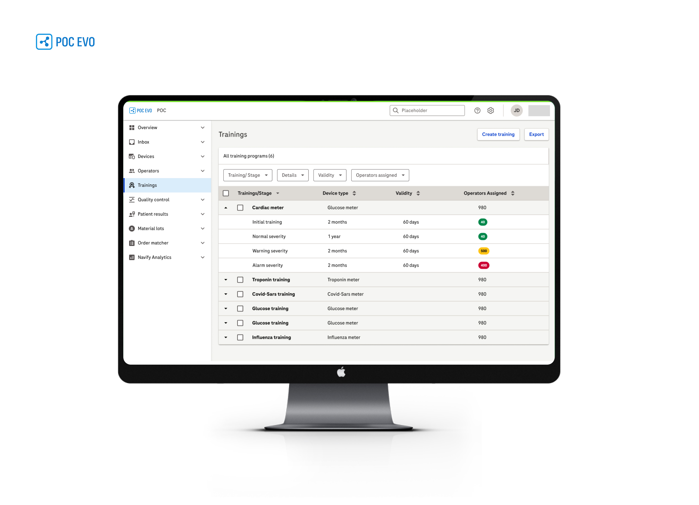
— Global UX Core Team (Switzerland) — Andrea Mabellini, UX Lead (60% strategic / 40% operational) · 2× UX Researchers · 2× UI Designers
— the client Spain — 2× UX Designers (Infinity Edge)
— the client India — 5× UX Designers (Infinity Analytics)
— ERNI (Philippines) — UI agency, development & UI support for Infinity Edge
— GLG — interview agency, access to POC Coordinators & clinical specialists globally
Key stakeholders — Business PMs · Tech Leads & Engineering · Clinical Experts · Regional Affiliates · Program Leads
Context & Problem
The three products
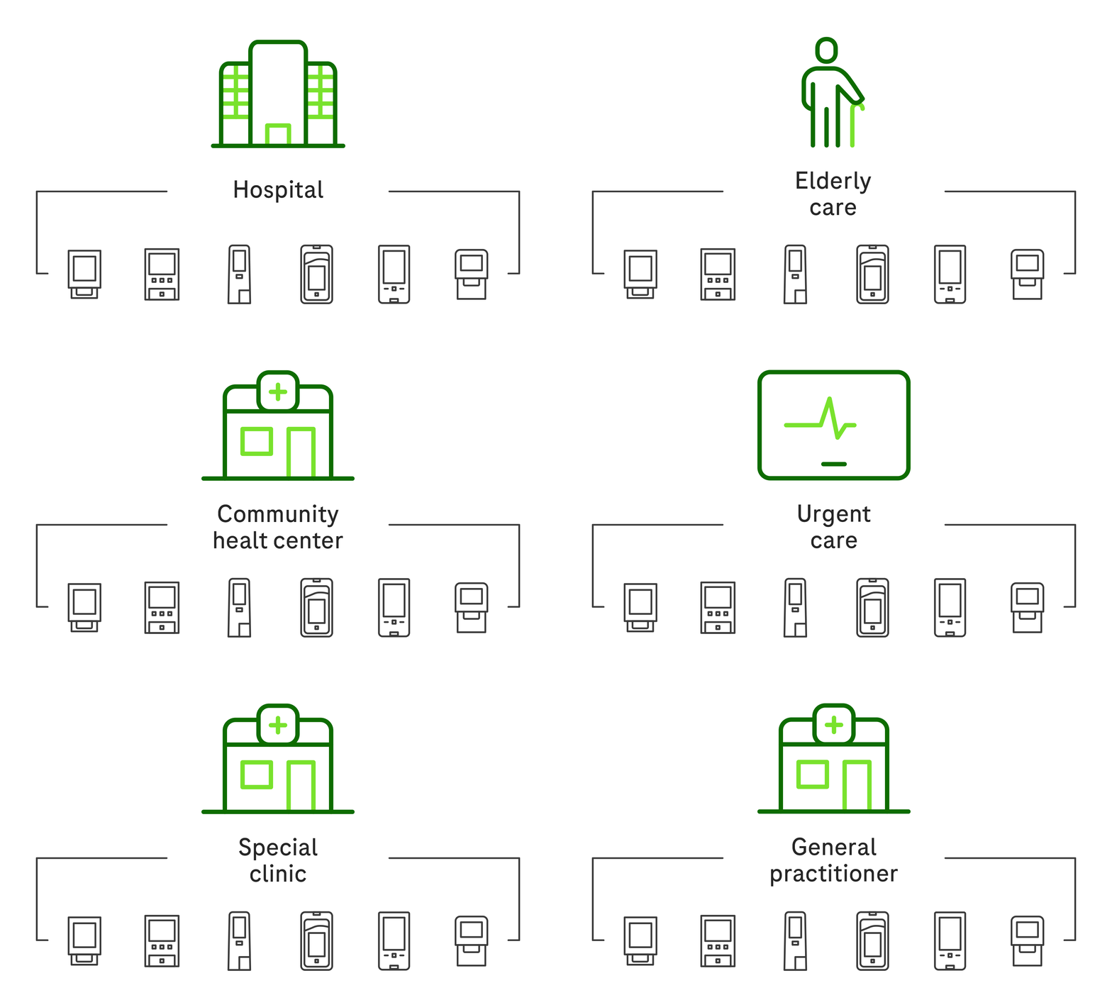
— Infinity POC — Device management: QC, operators, patient results, software updates. The operational core — the platform where coordinators manage daily testing across all connected devices and sites.
— Infinity Analytics — Cross-device data layer for performance monitoring, error rate analysis, and operational trend identification. Designed to surface insights across the entire POC network — turning raw test data into actionable intelligence for lab managers and clinical leads.
— Infinity Edge — Connectivity for primary care, pharmacies, and GPs. Extends POC reach beyond hospital walls into ambulatory settings, maintaining the same compliance model and data structure as the core platform.
The ecosystem context
The three products were components of a broader integrated diagnostics platform — designed to cover hospital, community, and ambulatory care settings within a unified data and governance model. Unifying the UX was the prerequisite for making that ecosystem function as a single platform rather than three parallel tools.
The strategic problem
— Three disconnected products — no shared design language, data model, or workflow logic
— Affiliates losing enterprise deals — product couldn’t be demonstrated credibly at scale
— Coordinators running on workarounds — critical tasks like operator certification tracking, QC scheduling, and multi-site compliance were managed via spreadsheets, printed checklists, and phone calls. The product didn’t support these workflows, so workarounds had become the de facto process
— Platform shift underway — The company moving POC from isolated solutions to a foundational layer of a broader digital diagnostics ecosystem — designed to span hospital, community, and ambulatory settings at enterprise scale.
Business trigger — The three products had become technologically and competitively obsolete. Hospital networks were consolidating around modern enterprise platforms, and the existing software could no longer meet market expectations. The decision had already been made: rebuild from the foundation.


Research Strategy
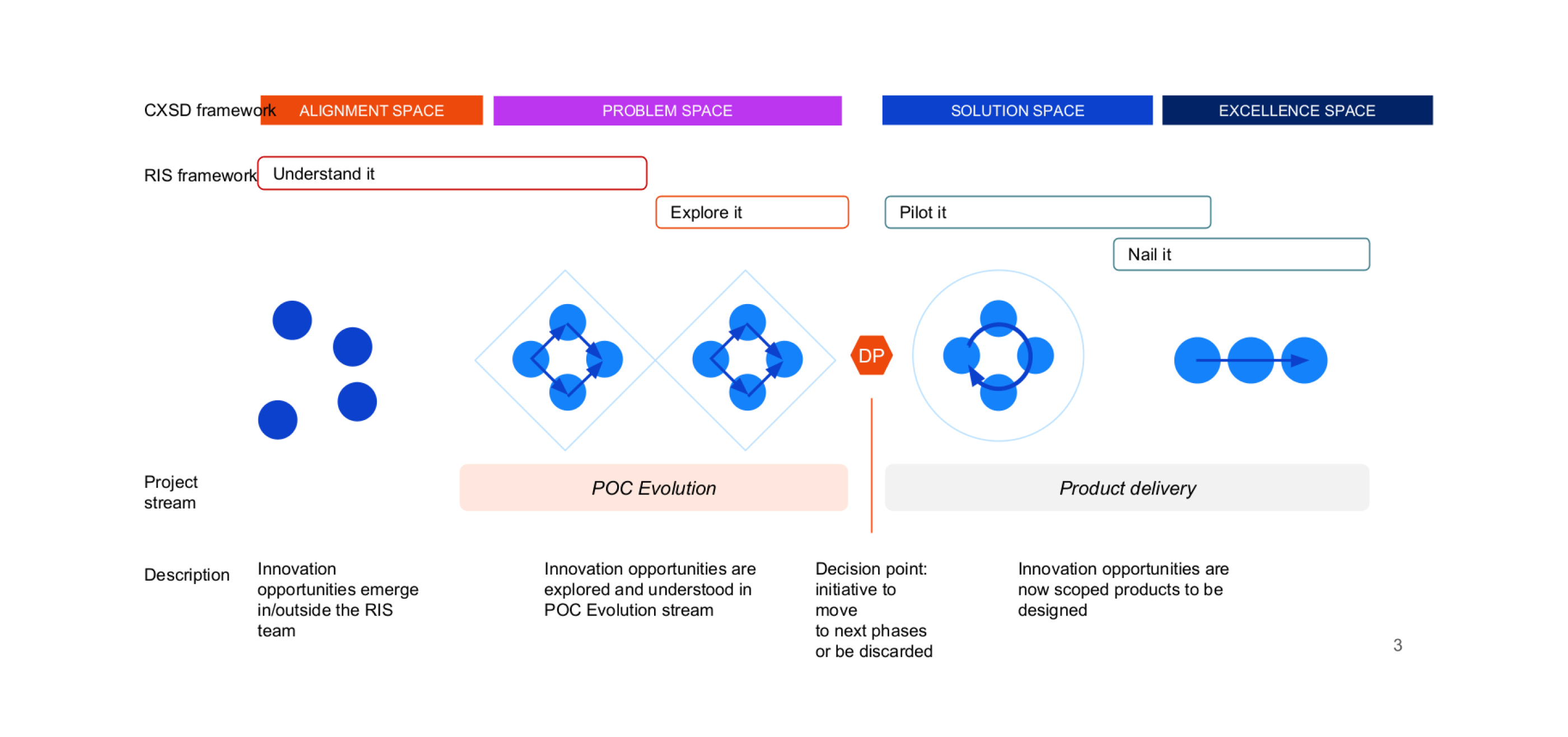
As UX Lead, I designed the research strategy together with two senior UX Researchers — aligning on methods, scope, and sequencing before fieldwork began. Research sat within the Explore it phase of the RIS (Research & Innovation Space) framework.
The platform covered 7 modules: Operators, Training, Quality Control, Devices, Patient Results, Analytics, and Material Lots. Research prioritised Operators and Training first — highest pain, highest compliance risk, first modules in scope.
Research at a glance
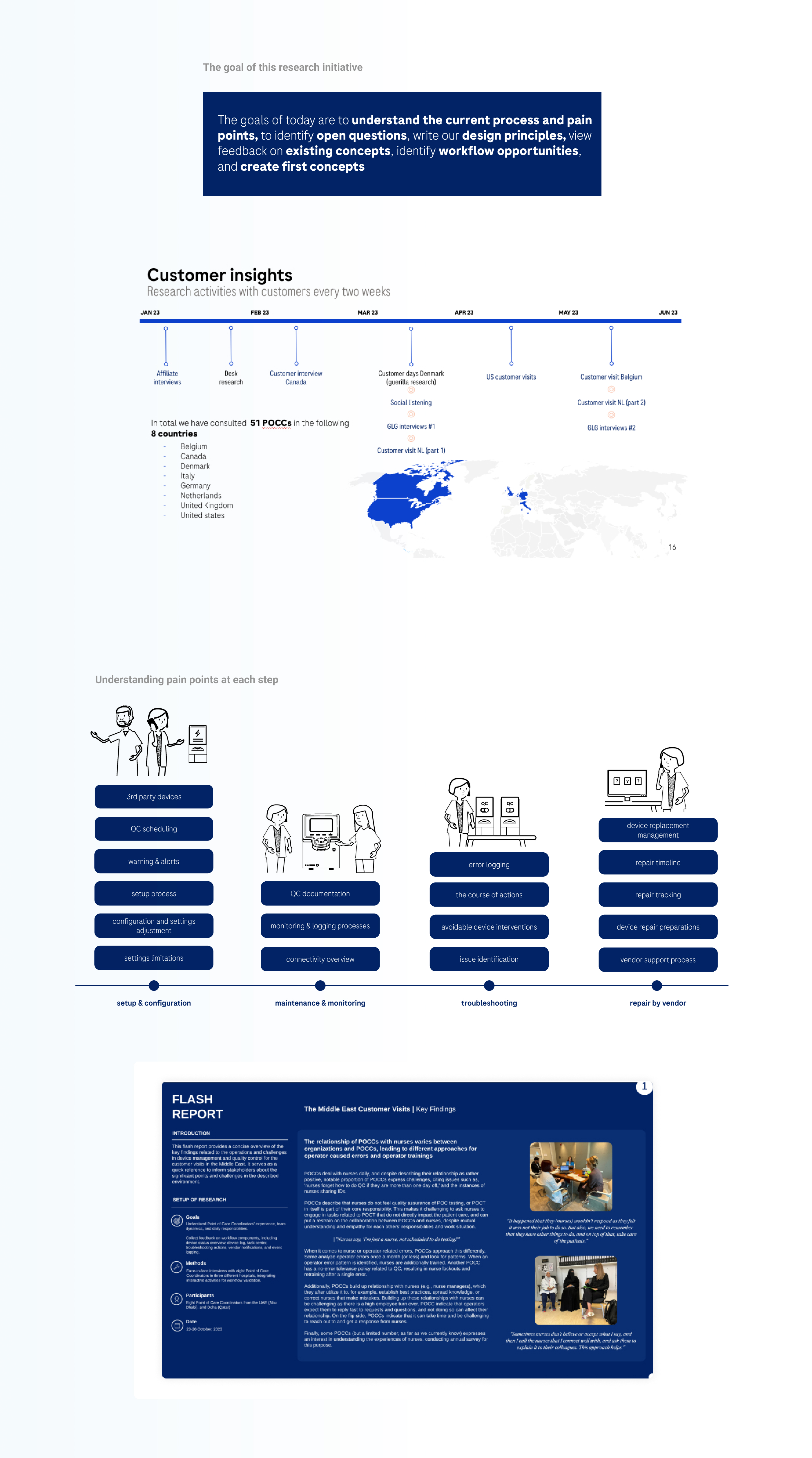
— 6 months · Jan–Jun 2023 · bi-weekly cadence · 51 POC Coordinators · 8 countries
— Methods: on-site observation, customer visits, GLG expert sessions, operator management deep-dives, sacrificial concepts
— AI-assisted synthesis: GPT-4 used to cluster interview themes, identify patterns across 51 transcripts, and generate initial affinity maps — reviewed and validated by the research team
Stakeholder alignment
— Bi-weekly readouts · Engineering and Clinical joined user sessions directly
— Decision Point brief — top pain points, validated opportunities, compliance risks, go/no-go recommendation
Opportunity prioritisation — Frequency · Severity · Feasibility · IVD filter · Alignment gate
Research output formed the Decision Point — the formal gate before Solution Space.
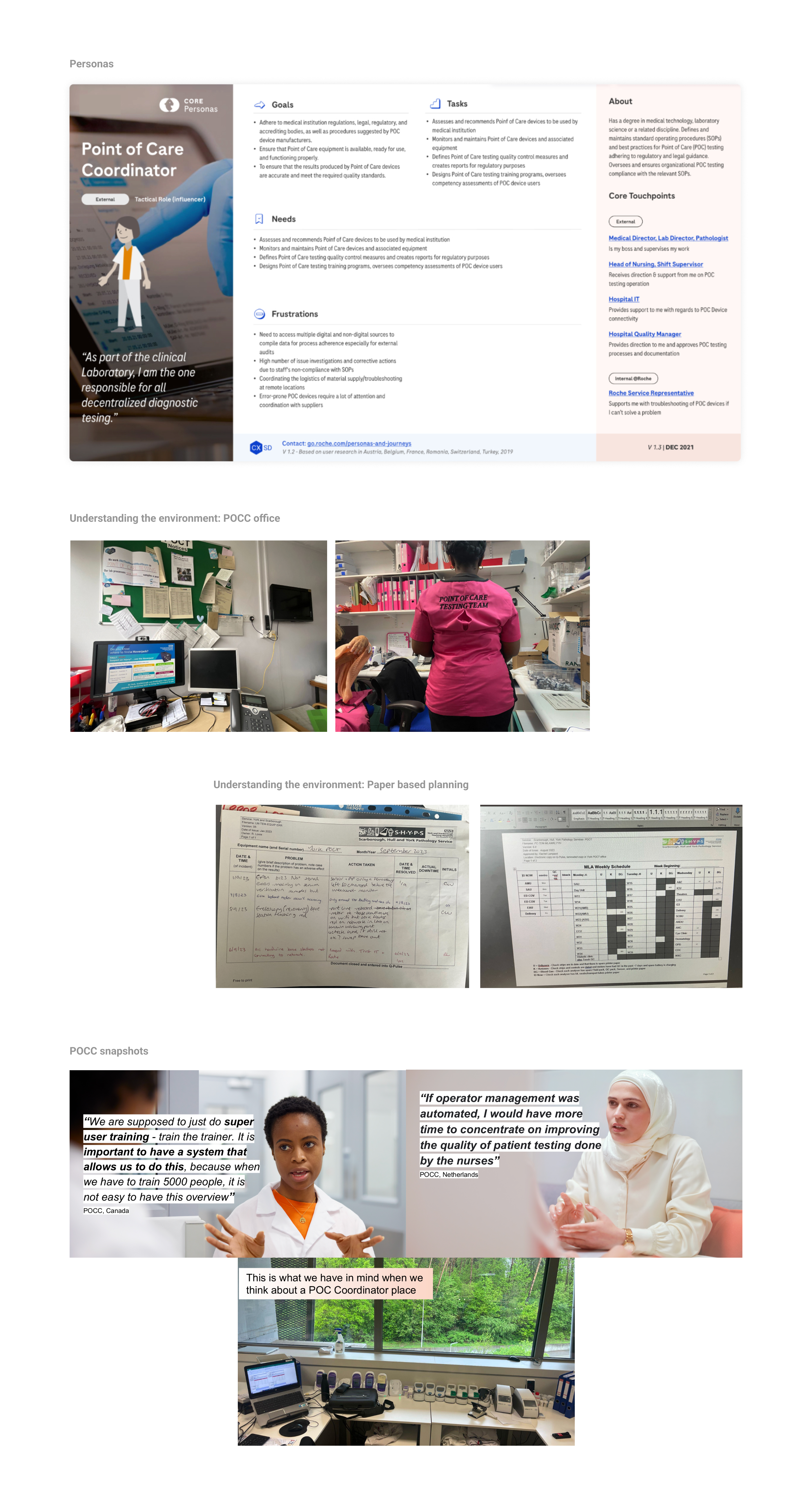
Point of Care Coordinator
With Operators and Training as first modules in scope, the POCC became the immediate research focus — they own both workflows end-to-end. Validated and expanded through interviews, on-site visits, and observation across 8 countries.
Other core users of the platform
— Lab Manager / Medical Director — oversees compliance and quality standards across the department
— Operator / Nurse — performs daily POC tests; managed and trained by the coordinator
— Hospital IT — manages device connectivity, network setup, and software updates
— Field Service Representative — supports troubleshooting, repairs, and on-site interventions
Key findings
— Mental model mismatch — coordinators think in tasks; product built around devices
— Certification burden — thousands of operator certifications managed manually
— Paper-based workarounds — checklists and spreadsheets for unsupported tasks
— Multi-site complexity — compliance tracking done manually across locations
Key insight: job structure identical across Germany, US, Japan — scale varied, not structure. This validated a single coordinator-centric IA for all markets.
User Journey Mapping
With the POCC defined, journey mapping answered: where does the workflow break? Research told us what was wrong. Maps told us where in the flow — and whether the product was even present.
Affinity diagrams were built using FigJam AI (in beta at the time) and GPT-4 — helping us cluster pain points and patterns from field notes at speed, before manual synthesis and team review.
What we found
— Surface failures — confusing interface, correct logic → UX redesign
— Structural failures — product modelling the wrong thing → architecture changes
— Workflow gaps — product absent where coordinators already worked → new functionality
Key insight: coordinators tracked certifications, statuses, and expiry dates mentally — the product captured none of it.
A key pivot
We initially designed around the individual operator detail page — assuming the main need was better data entry. The journey map showed something different: coordinators never needed to go deeper into one operator. They needed to see all operators at once — who was compliant, who wasn’t, who was expiring. The pivot: from operator detail → fleet-level compliance overview as the primary screen. This changed the entire IA of the Operator Management module.
Share-outs — bi-weekly readouts · walkthroughs for Business and Program Leads · final maps in the Decision Point brief

Key Learnings After Research
The core finding: the problem was structural — the product wasn’t built around how coordinators actually worked.
Key findings
— Disconnected products — three tools, separate navigation and data models, no shared context
— No real-time visibility — task status invisible until something went wrong
— Manual coordination — data reconciled by hand across systems
— Fragmented roles — labs, clinicians, operators in silos
Key insights
— Real burden was cognitive — coordinators tracked mentally what the product didn’t capture
— Operators and Training: most-reported pain, highest compliance risk, highest leverage
— Reframed the brief from UX improvement to platform redesign
What this defined — Unified coordination model · Operators and Training as first module baseline · Success criteria later formalised as OKRs and KPIs
Research: Hypothesis vs Reality
— Initial assumption — Users needed a better interface for existing workflows.
— What research revealed — The workflows themselves were broken. Coordinators bypassed the system entirely — spreadsheets, checklists, phone calls — because no shared data structure existed across roles.
— Shift in scope — From “redesign the UI” to “redesign the information architecture and data ownership model.” This changed the brief.
Design Process & Pivots
With research done, we moved into Solution Space — the Pilot it phase of RIS (Research & Innovation Space). The CXSD framework gave the team a shared language to agree on what to build, in what order, and why.
The core tension — Business: speed and features · Engineering: wrong architecture triggers IVD revalidation, costs months · My role: protect expensive-to-reverse decisions, move fast on everything else
Key design pivot: the navigation shell
Three products, each with separate tab-based navigation. For a coordinator switching constantly between modules — high cognitive load, no unified context. Research was clear: coordinators think in tasks, not products. The response: a left-side navigation shell unifying all three modules — one navigation, one notification center. Formalised at a 3-day workshop in Barcelona with leads from Switzerland, India, and Spain.
How we worked
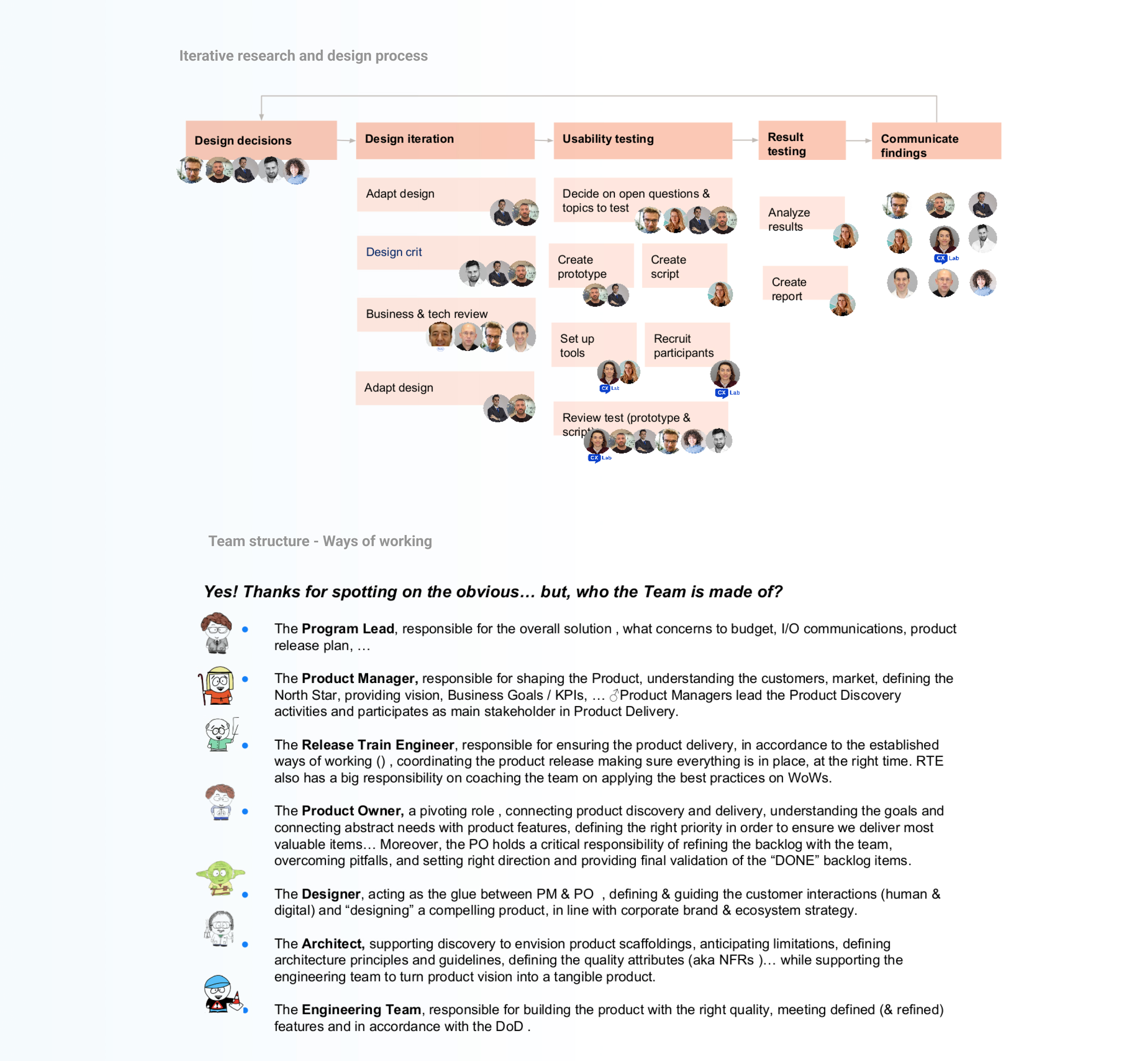
— 2-week sprints, design one PI ahead of Engineering
— Wireframe → Critique → Prototype → Usability Testing → Iteration → Handoff
— UserTesting.com with POCCs across countries · Usability Engineering File — IEC 62366, signed off by Human Factors
People & oversight — CX Lab · Human Factors · Head of UX + UX Managers (bi-weekly) · Engineering, Clinical, PM, Business at every milestone
From Findings to System
— What changed beyond navigation — Research uncovered 3 structural gaps: no shared data model, no role-based access, no cross-module visibility. Not UI problems — architectural ones.
— Scope shift — Original brief: redesign navigation. Post-research brief: redesign information architecture, data ownership, and role permissions across all 7 modules.
— Coordinator workarounds → navigation shell (one persistent context)
— Operator data silos → unified data model across Operators & Training
— Cross-role errors → role-gated access replacing universal dashboard
Wireframes
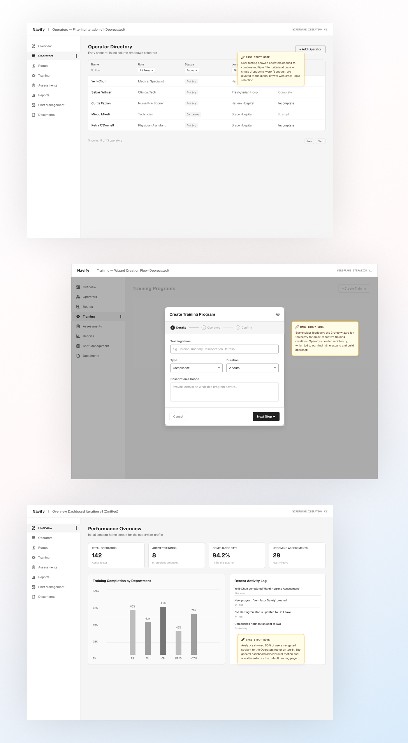
Before high-fidelity design, we validated IA and primary flows through low-fidelity wireframes. First wireframes covered Operator Management and the left-side navigation shell — the structural backbone for all three products.
— Content hierarchy — information prioritised within each module
— Recurring patterns — filterable tables, detail modals, KPI dashboards — standardised early
— Navigation behaviour — coordinator movement within the unified shell
Deprecated iterations caught at low cost before any high-fidelity work began.
Mockups & Key Design Decisions
Mockups were the output of validated decisions — every flow had passed research review, engineering feasibility, and at least one critique round first.
— My role — navigation model, use cases, flows to prototype; coordinated and reviewed every iteration
— UI Designers (×2) — executed and iterated based on critique and research feedback
Chronology
— Navigation shell — first deliverable post-Barcelona; left-side nav, notification center; all devices including cobas pulse
— Operator Management — first module; operators, roles, access across locations
— Subsequent modules — use case → wireframe → critique → prototype → usability test → iteration
Key design decisions
— Navigation shell — Persistent shell across all 7 modules vs. isolated screens. Chosen because coordinators switch context constantly. Rejected tab-based nav: too much context loss between tasks.
— Operators & Training first — Of 7 modules, these two were prioritised. Research showed the highest density of workarounds here — the rest deprioritised pending validation.
— Role-based visibility — Data access tied to role (Coordinator / Operator / Admin). In 4 of 5 observed sessions, cross-role data caused errors. Rejected universal dashboard.
— Task + status dashboard — Replaced device-list home — coordinator’s morning workflow. Rejected feature-list layout: no status context.

Design Critique & Validation
Design Critique was the formal gate between mockups and prototyping — Engineering, Clinical, PM, and Design before any build decision.
Format
— Problem brief upfront — feedback anchored to constraints, not preferences
— 2 directions side by side — trade-offs explicit, decisions documented
— Four fixed questions: Right mental model? · Buildable in phase one? · Regulatory compliant? · Product goal met?
— Design system tokens validated — triaged as ship or block
Feedback management — Sticky notes as block or note · UI Designers iterated, I reviewed · 2–3 rounds per flow; safety-critical: 3+ minimum

Usability Testing
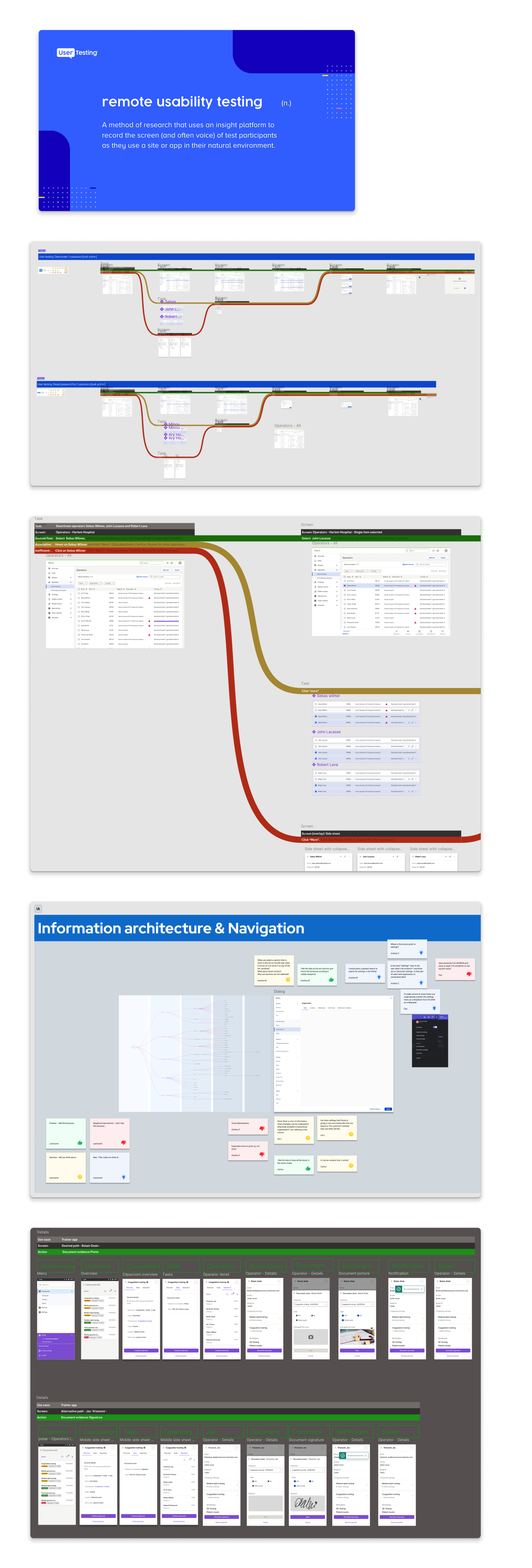
After each critique, validated concepts moved into structured usability testing — stress-tested with real users.
Two methods
— Moderated sessions — researcher guided POCCs through tasks, capturing mental-model mismatches. Run by CX Lab
— Unmoderated via UserTesting.com — broader validation across multiple countries
How managed — Test scripts reviewed by me · CX Lab reports by severity & frequency · results shared with all stakeholders · nothing left open without a resolution
What we tested for
— Navigation clarity — left-side shell and unified frame
— Task completion — rate and time on critical workflows
— Compliance-sensitive interactions — where a wrong action creates regulatory or patient safety risk
Definition of Success & Results
The product had not yet launched. Success was defined by how many critical decisions survived evidence-based testing before engineering began.
POC EVO was the most significant project in the CXSD 2023 portfolio — first to run the full RIS (Research & Innovation Space) framework end-to-end. The process became a reference framework for other product teams within the UX organization.
Validation criteria
— Scope aligned before sprint start — Engineering, Clinical, PM, Design agreed on phase one
— IA validated — 85%+ task completion with 8 POCCs across 3 markets
— Fewer steps on critical flows — QC from 9 to 5 steps; fleet status in one dashboard
— Prototypes passed usability testing — 4 of 5 top workflows cleared the first round
— Clinical sign-off — QC and device approval workflows approved with documented usability evidence
After launch, a companion product for ambulatory and community settings was released on top of the same platform architecture — validating the multi-site, multi-environment data model designed during research. The unified data model held across both environments without architectural redesign.
What we built as a foundation
— Navigation shell — unified left-side nav across all three products
— Shared design system — common token layer across Infinity POC, Analytics, and Edge
— Ways of working — critique format and sprint cadence adopted across subsequent modules
— Operator Management validated — first full cycle, establishing the repeatable pattern
In a regulated medical environment, the cost of discovering a problem after launch is categorically higher than before. POC EVO set the standard for UX-led product design within the CXSD team.
Use any form
Design impactful user experiences with ease—everything you need is at your fingertips.
Feel free to reach out for a project inquiry, a coffee chat, or a consultation. Let’s explore how I can help you achieve your design goals. Whether it’s crafting impactful experiences or discussing innovative ideas, I’m here to collaborate and bring value to your vision.