introduction
I led the UX strategy and evolution of a unified design system within a global healthcare ecosystem, used by hundreds of designers across multiple teams and products. My role focused on structuring the system beyond visual consistency, aligning decision-making, enabling scalability, and ensuring coherence across a complex landscape of digital solutions. This involved coordinating internal and external stakeholders, defining shared principles, and supporting the adoption of a scalable UX framework across the organization.
Client
Andrea Mabellini
Date
Categories
Tags

12
components
1
Millions saved
About the project
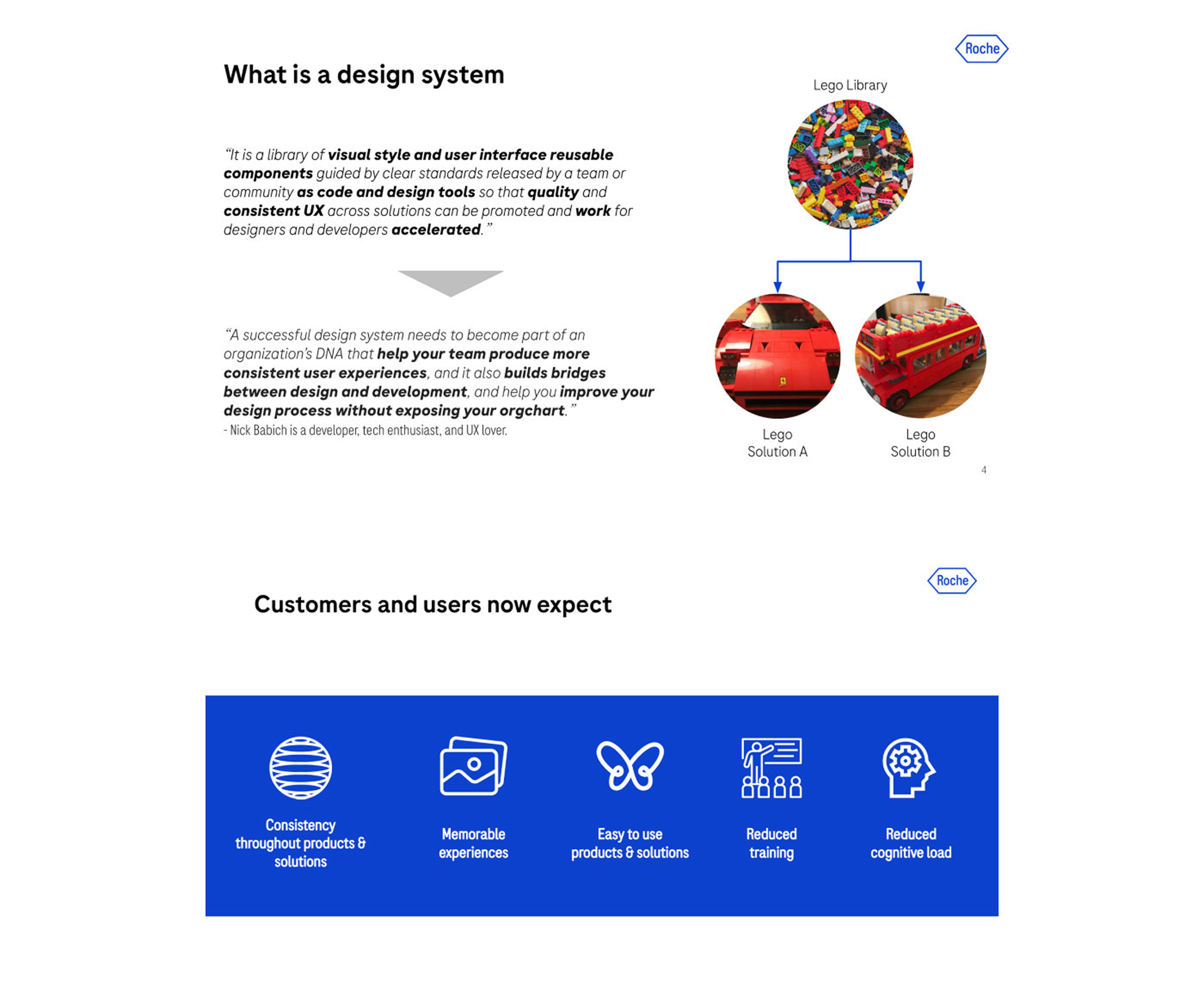
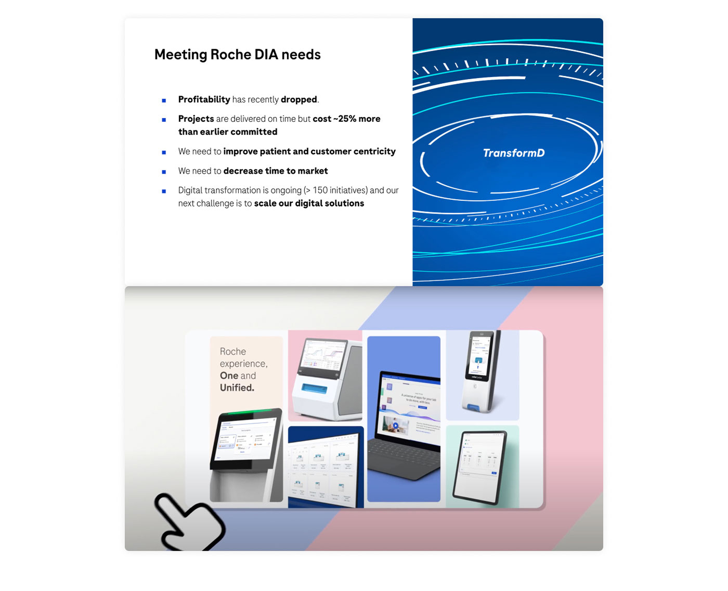
The design system served as a foundational layer across a large-scale healthcare ecosystem, supporting multiple teams and products in delivering consistent and high-quality user experiences. Rather than focusing solely on components and guidelines, the work addressed the need for a structured UX system that could scale across projects, reduce fragmentation, and align decision-making. My contribution involved defining the system’s architecture, establishing shared principles, and ensuring alignment between design, product, and engineering teams. This enabled smoother collaboration, improved consistency, and more efficient integration within development workflows.

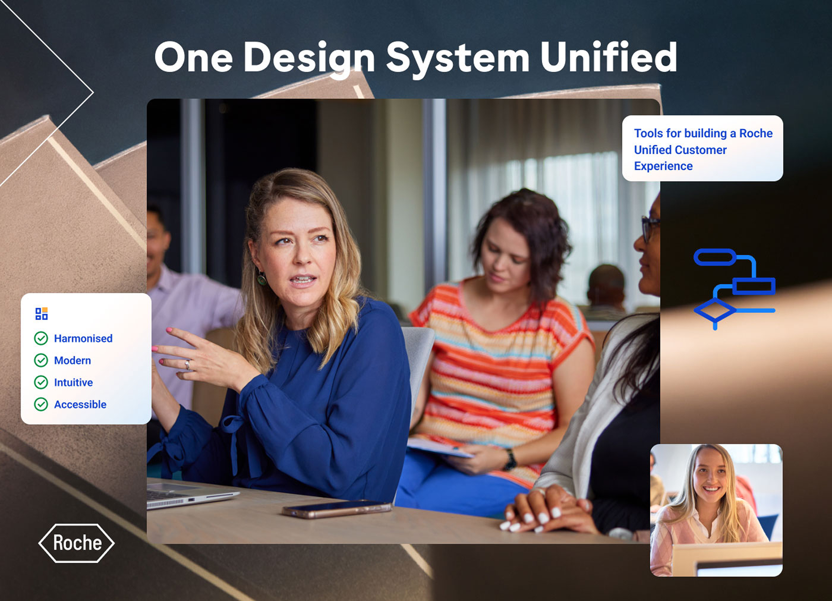

The ODSU uses a unified set of components to provide a consistent experience for customers and greater efficiencies to designers and developers.
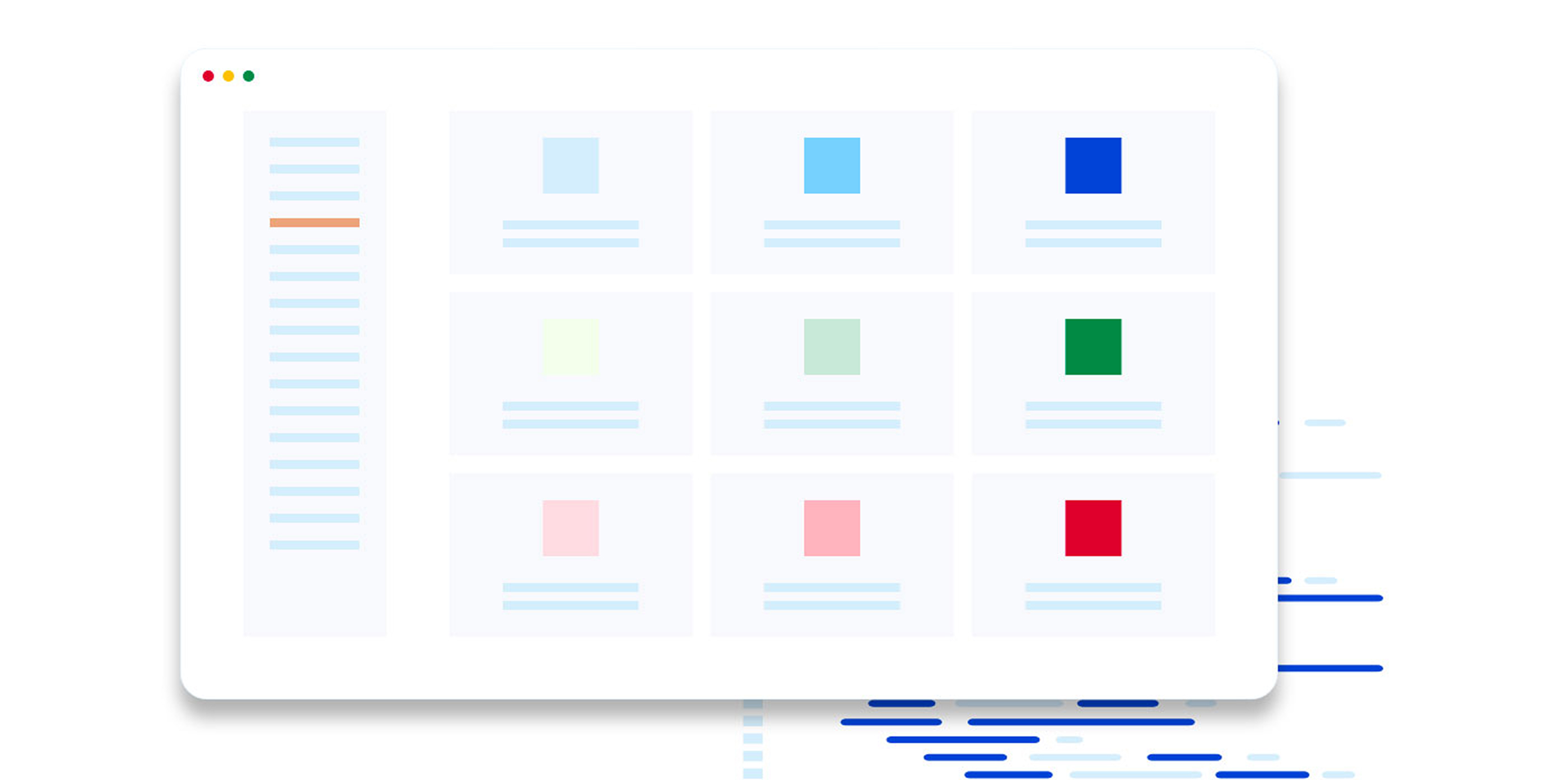
Theming within the code and the design kit automatically applies theme-specific styles to components. As a result, the same design kit and code base can be used to create a UI that looks like a native product, in light or dark mode; or a cobas® product, in light or dark mode. As of August, 2023, the ODSU OneWeb Components (OWC) 6.0 Library for developers and ODSU Kit 2.0 for designers are in sync – components in the ODSU Design kit have matching counterparts in the OWC repository.
Designers and developers across various design teams have worked together to create this library of intentionally designed, developed, and tested components that have been evaluated for accessibility. This effort is the foundation of our product customer experience.
Some numbers
1910 Customers in 56 countries
125 Drivers supported (POC devices)
5368 Drivers installed
240.650 POC devices connected
Scope of work
I lead the UX design for the Design System Library.
The scope of my contribution was to create, maintain and support a library that could be exploited by more than 200 projects, and avoid hardcoded design and code, and predominantly ensure consistency.
Research
Duration: Ongoing
Customer interviews, shadowing, journey mapping, validated list of assumptions, competitor analysis.
Service design
Duration: Ongoing
Focus groups, information sorting, business case, feedback on desirability, willingness to pay.
Visual design
Duration: Ongoing
Definition of the UI guidelines, visual design, typography, colours, tone of communication, layouts, mockups, prototyping, creation of the library and design system., features ready.
Usability testing Duration: Ongoing
Usability testing validation, formative and summative testing. Unmoderated testing on Usertesting.com, Moderated on site UT, hands off to devs.
Planning
Empathise, listen, interviews.
Interactions
Defining, problem statements.
Iterations
Design sprints, reviews, adjustments.
Delivery
Hands off, specifications, validation.
Key points
Multiple brands
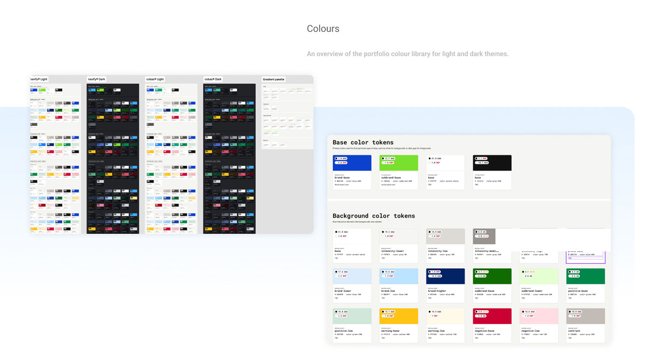
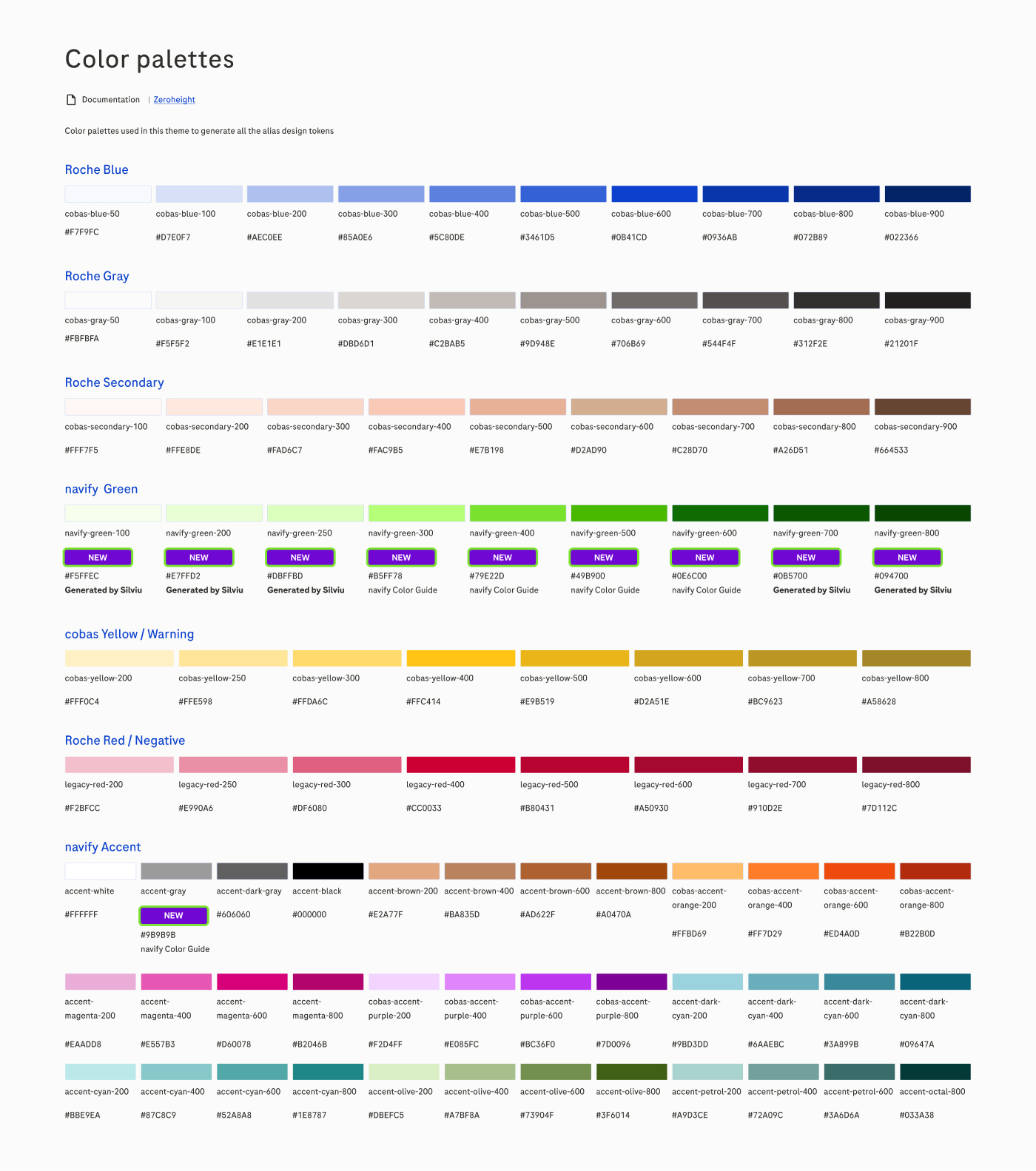
Theming is a build in feature and multiple brands are supported out of the box (currently cobas® and navify®).
The component library (OneWeb Components) is framework agnostic and can be used in any Javascript frontend framework (e.g React, Angular, Vue).
The component library (OneWeb Components) is developed under the Design teams Quality system and is fully compliant to be used in in vitro diagnostics applications.
The component library (OneWeb Components) repository is visible for anyone working in the company and client developers can contribute (Innersource Approach).
– OneWeb Components Library Repo
– OneWebComponents Library Documentation
Key learnings after research
Through adoption tracking, internal data, and cross-team feedback, it became clear that the real value of the design system was not only consistency, but its impact on scalability, efficiency, and cost reduction across the organization.
What we observed:
Rapid growth in adoption across projects and teams
Increasing dependency on shared components and patterns
High duplication of effort before the system was introduced
Fragmented design and development practices across products
What this meant:
Significant time was previously spent rebuilding the same components
Inconsistent UI patterns increased maintenance and QA effort
Lack of standardization slowed down both design and development cycles
Scaling products across brands required redundant work
What changed in DS:
Centralized component library reused across multiple products and brands
Shared guidelines improved alignment between designers and developers
Standardized patterns reduced design and technical decision overhead
Documentation (Zeroheight) enabled faster onboarding and knowledge sharing
Impact:
Shift from building from scratch → assembling from system
Reduced dependency on individual teams and local solutions
Increased delivery speed and predictability
Stronger alignment between design, development, and business
Results
-50%
Increase in design productivity
-20%
Reduction in development effort
-25%
Reduction in testing and QA effort
1 FTE
Equivalent resource savings per project
Measurements
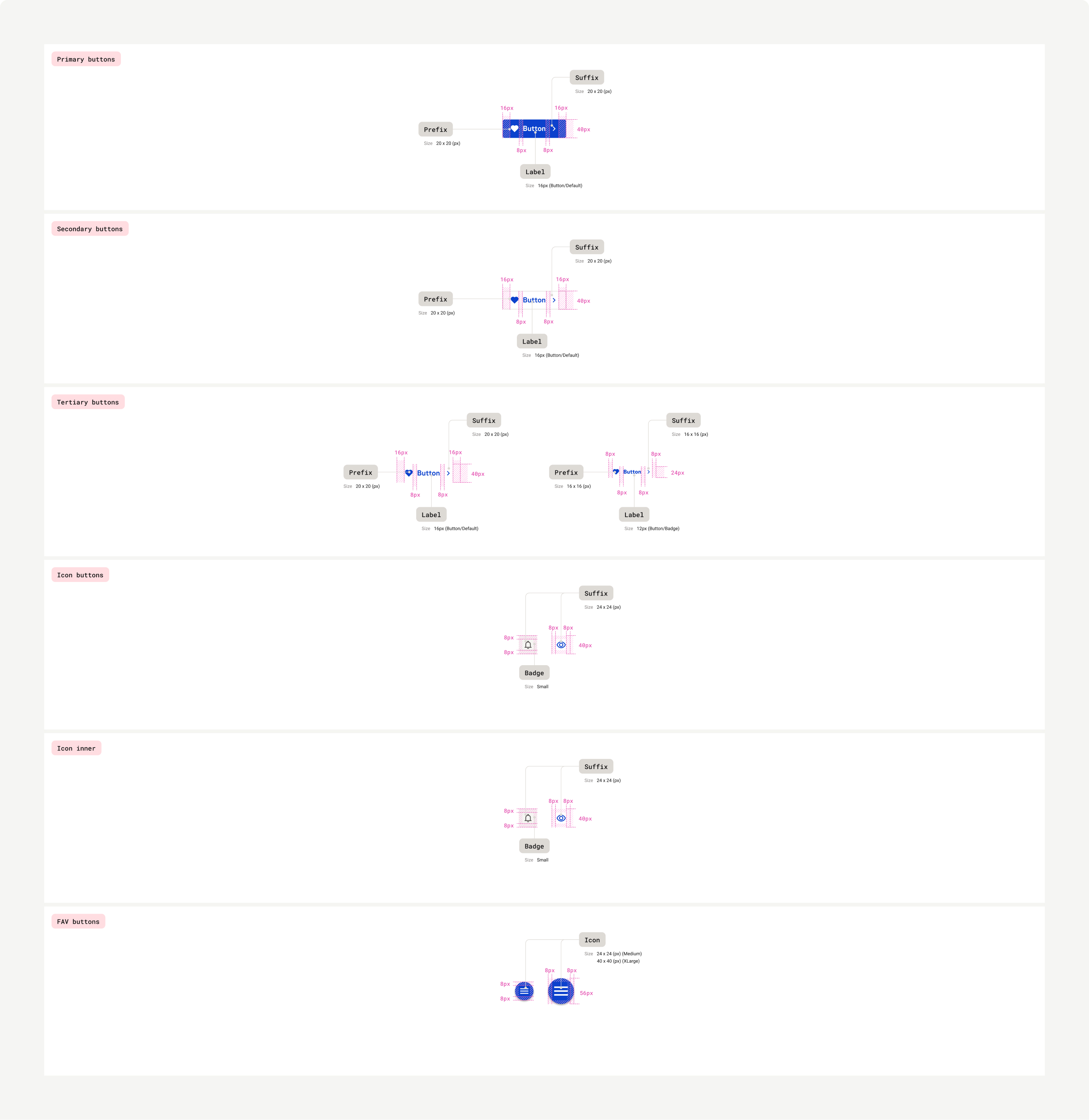
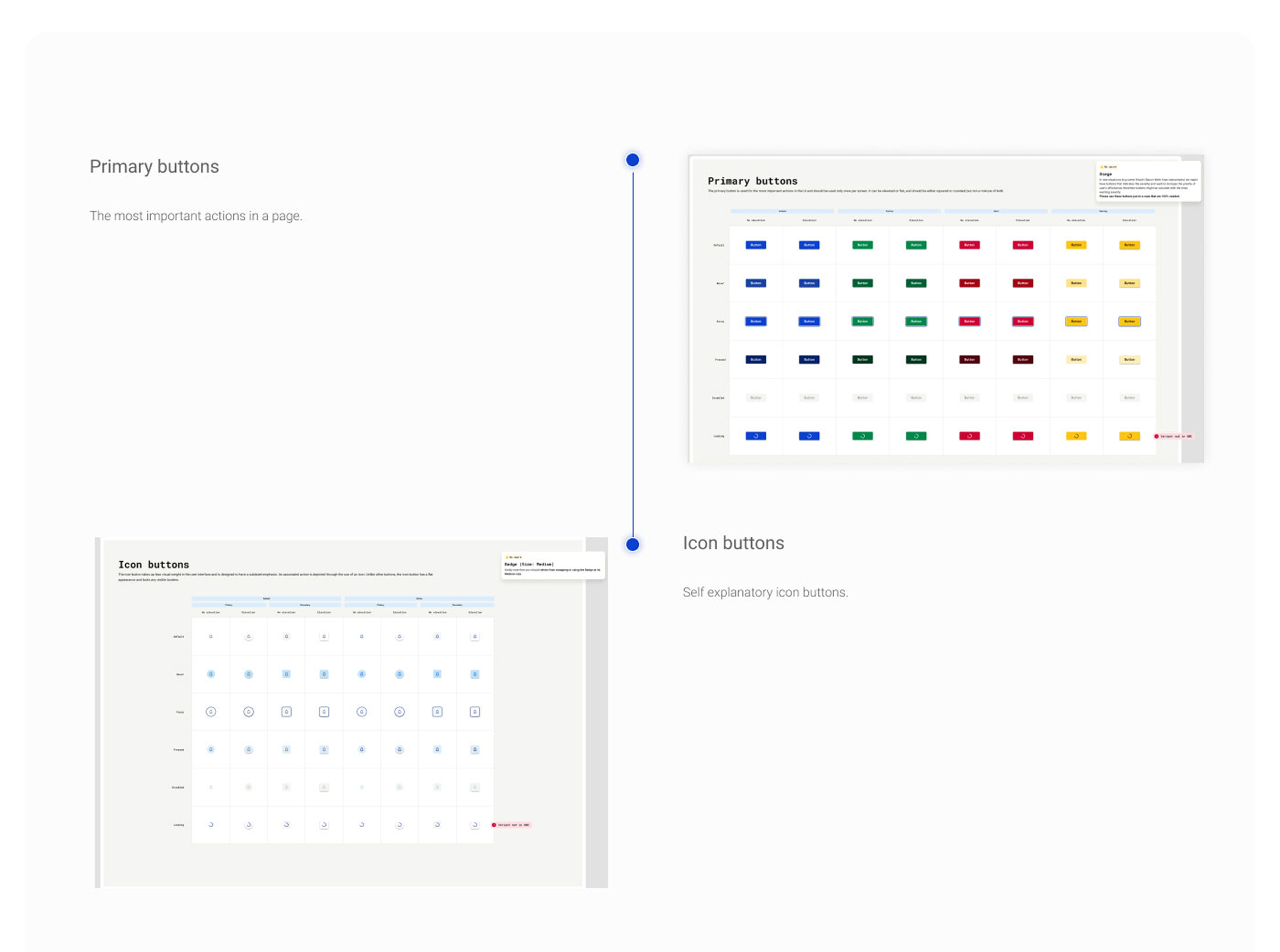
The primary button is used for the most important actions in the UI and should be used only once per screen. It can be elevated or flat, and should be either squared or rounded, but not a mixture of both.
Taxonomy
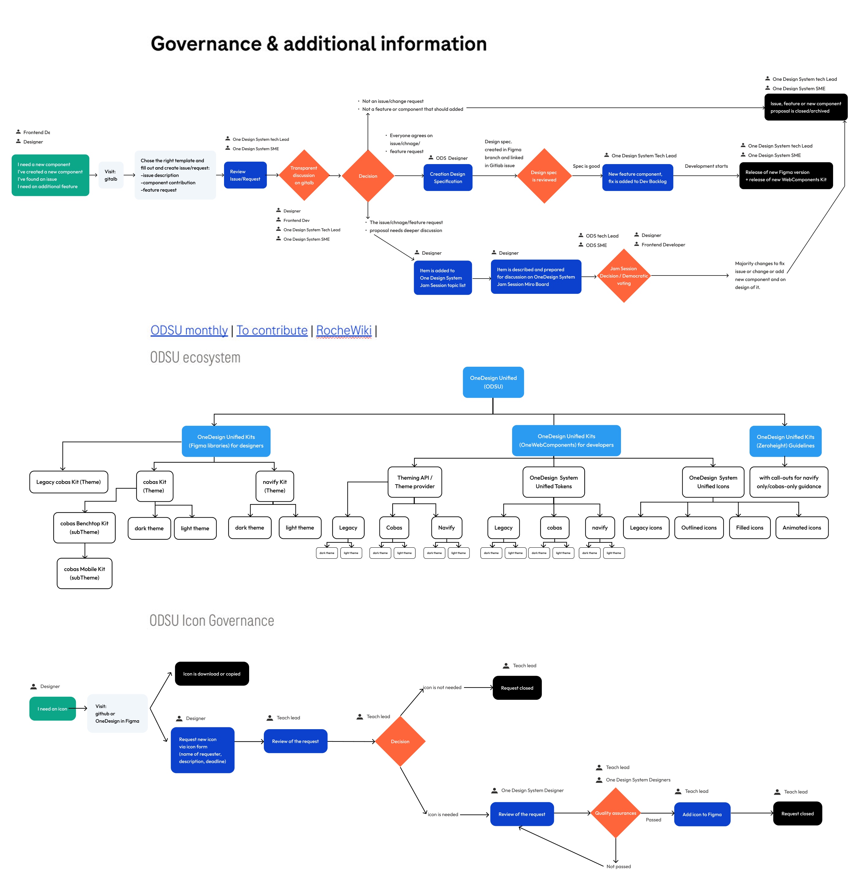
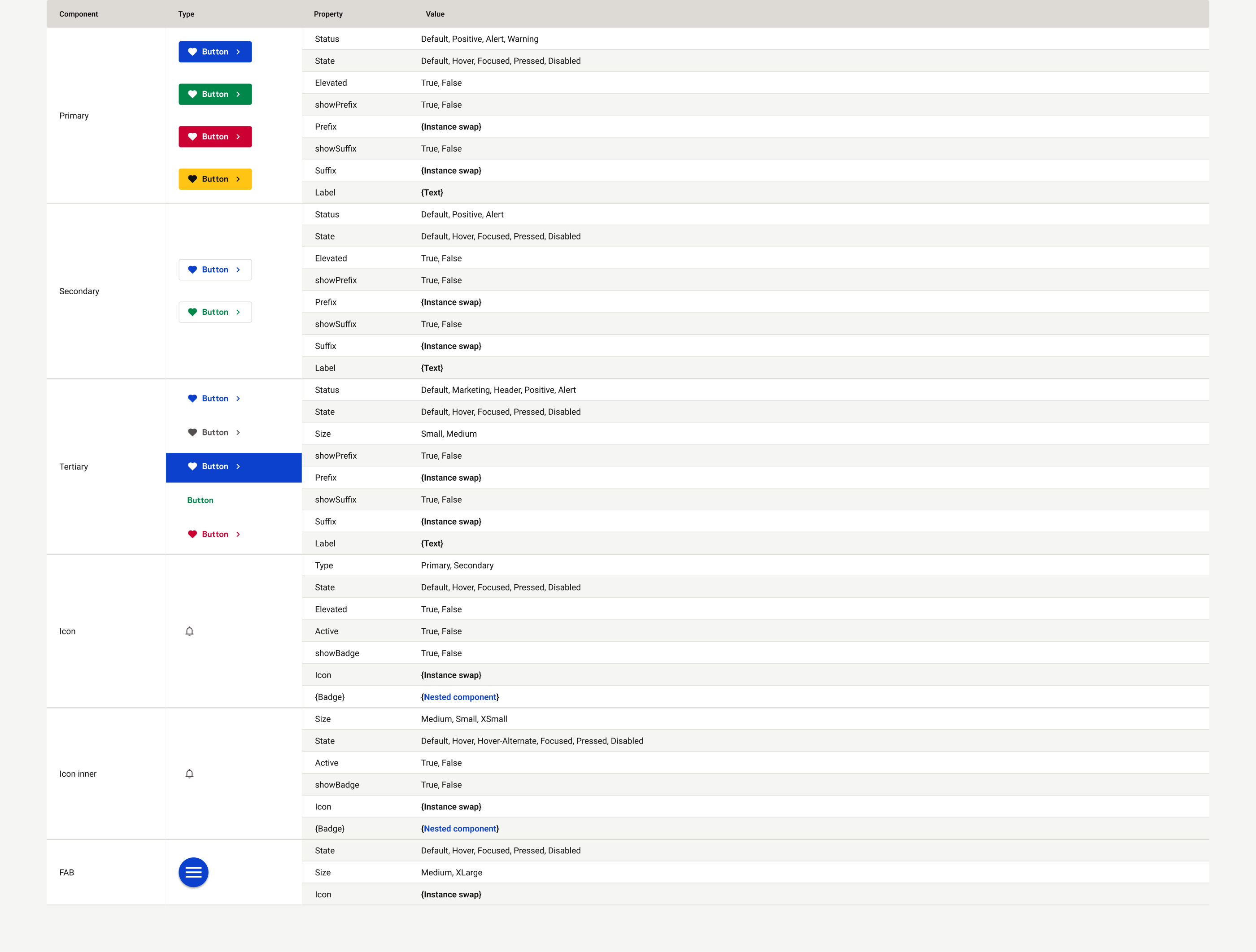
Using an organisational system that structures the design elements and building blocks in a consistent and logical manner, helps providing a shared vocabulary and visual language for everyone, making it easier to create and maintain a coherent and cohesive design system.
Logo
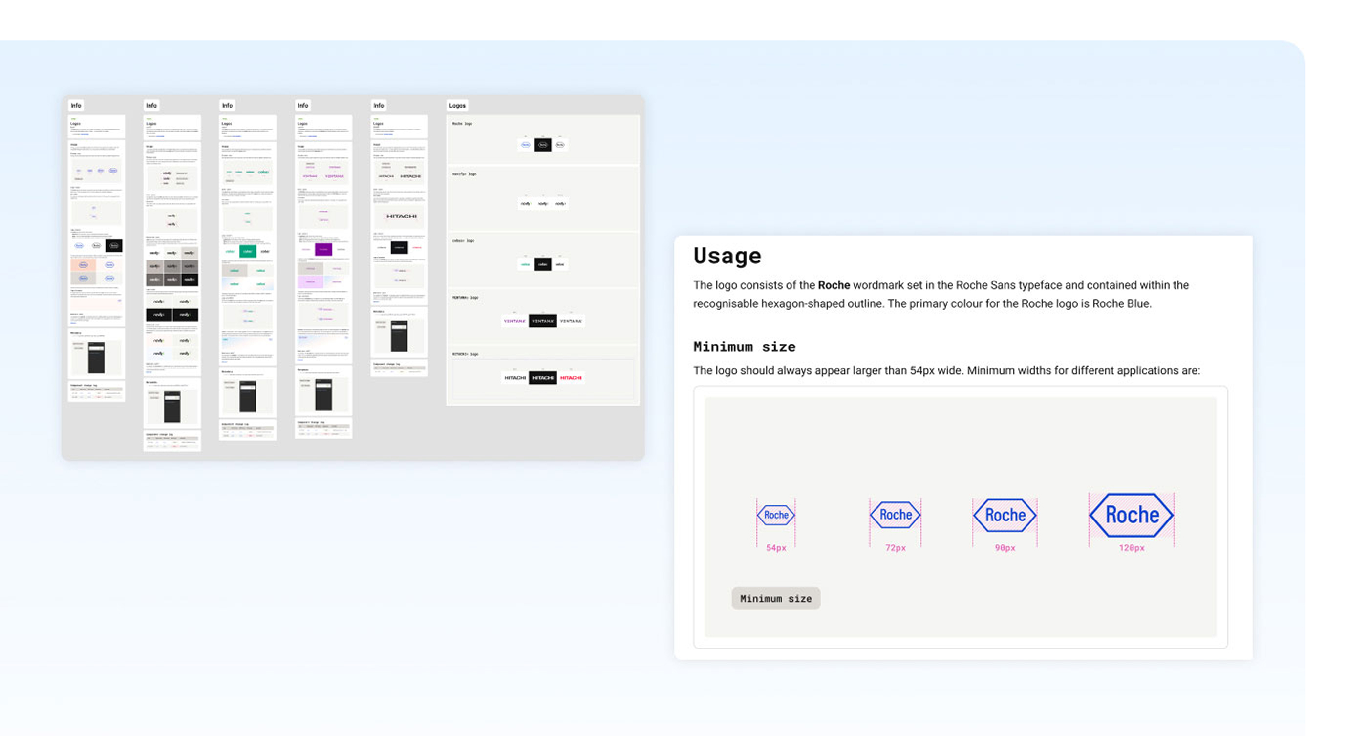
A clear set of logo usage guidelines defining sizing, spacing, and application rules to maintain a consistent and recognizable brand identity.
Atoms
The smallest reusable building blocks of the Design System, including buttons, icons, and other foundational UI elements used to create consistent interfaces.
Molecules
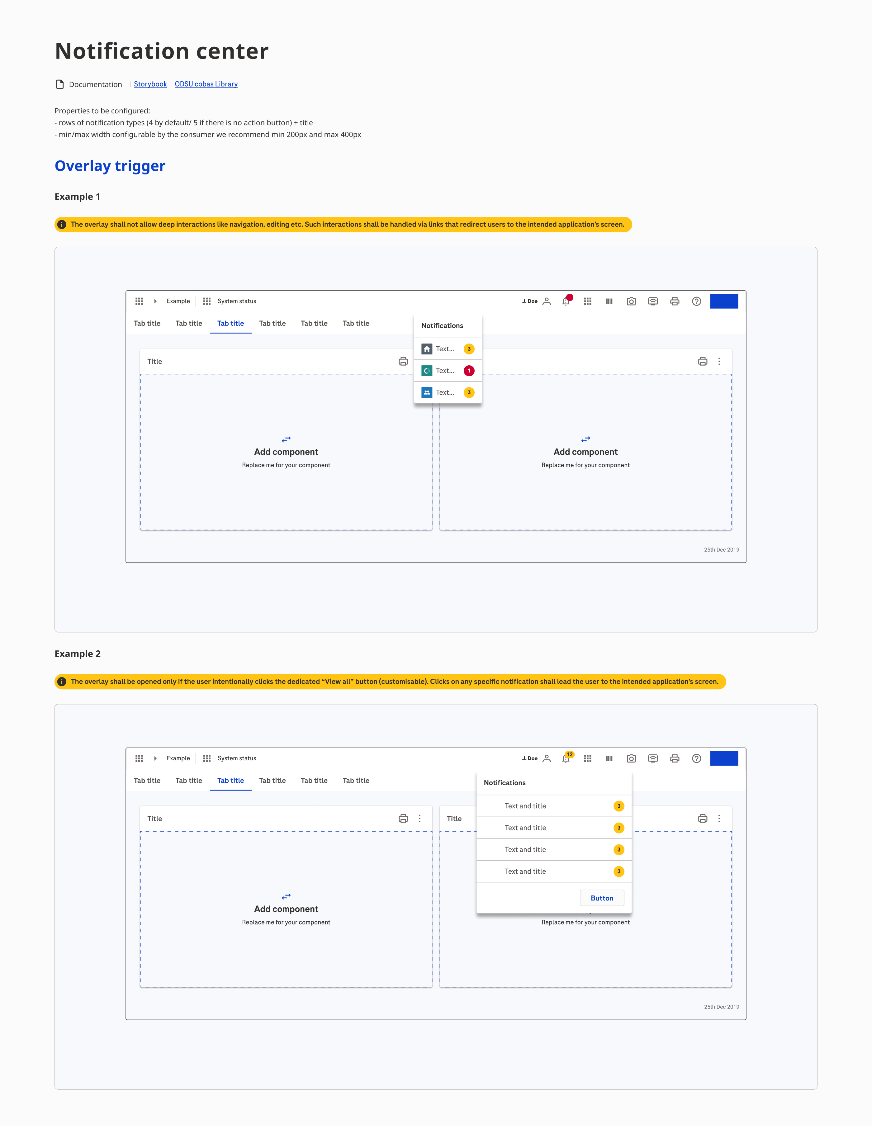
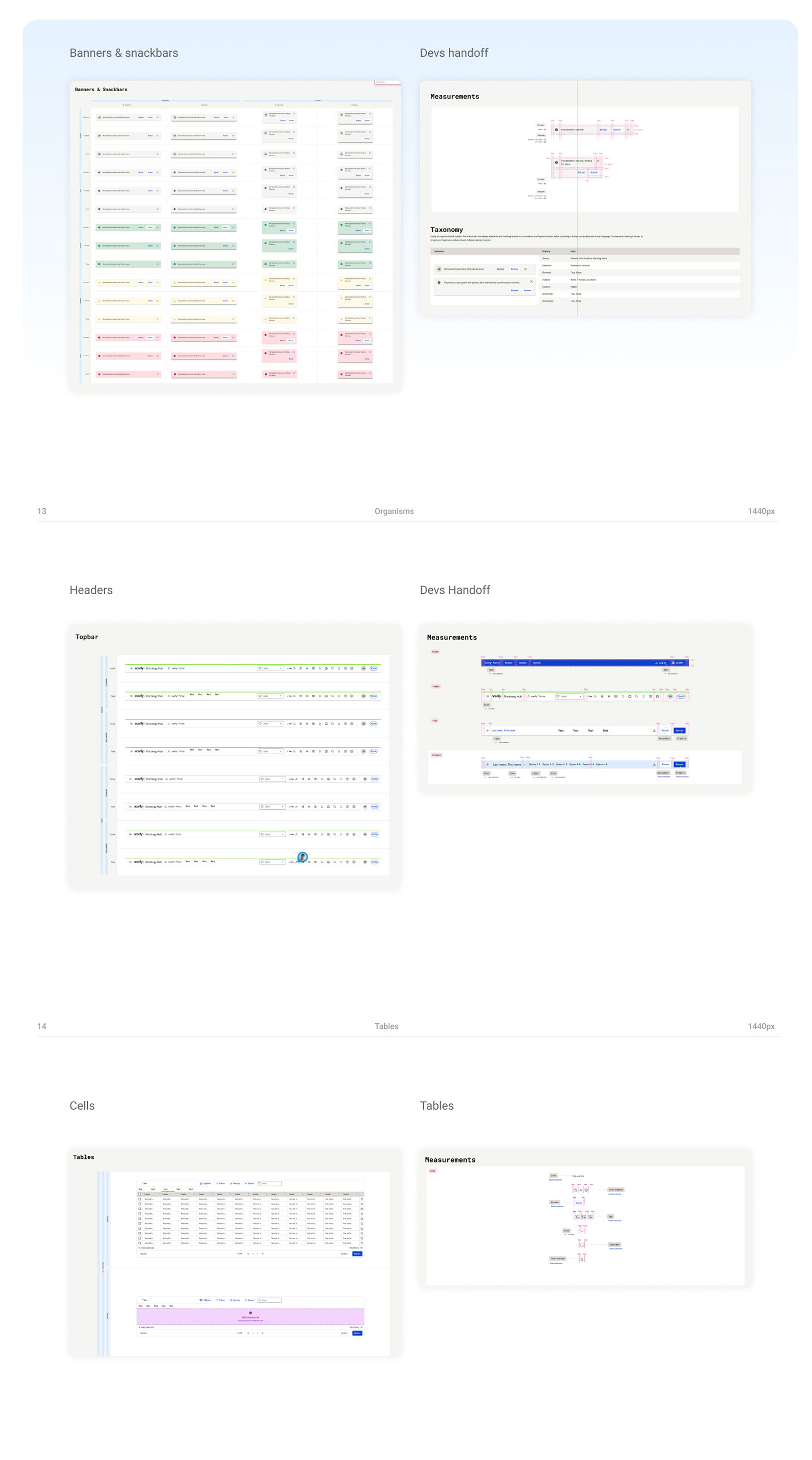
Reusable combinations of smaller components, such as banners and snackbars, designed to handle common interaction patterns consistently across products.
Organisms
More complex interface sections, such as headers, built by combining multiple components into scalable and reusable product structures.
Tables
Standardized table patterns defining cells, layouts, spacing, and behaviours to ensure clarity and consistency when displaying complex data.
Developer handoff
Detailed specifications, measurements, and implementation guidance created to reduce ambiguity and ensure accurate translation from design to code.
Key achievements & benefits
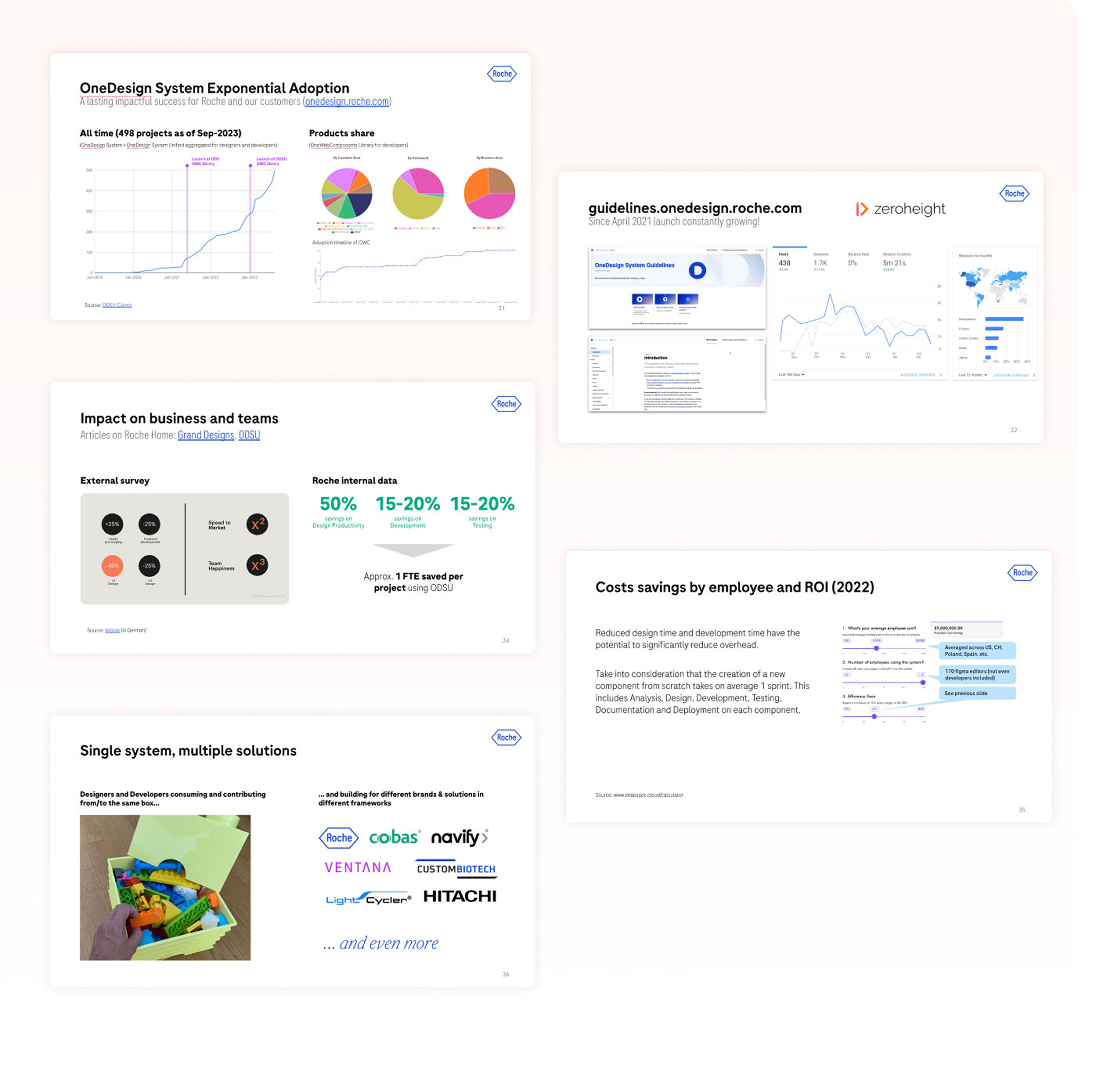
- Scaled to nearly 500 projects, demonstrating strong and sustained adoption.
- Increased design productivity by ~50% by reducing duplicated work.
- Reduced development effort by 15–20% through reusable, production-ready components.
- Reduced testing effort by 15–20% through standardized and validated patterns.
- Saved approximately 1 FTE per project across design, development, and testing activities.
- Supported multiple brands and product ecosystems within a single scalable system.
- Centralized guidelines and documentation improved consistency, discoverability, and team adoption.
- Lowered overall design and development costs, creating measurable ROI at scale.
Use any form
Design impactful user experiences with ease—everything you need is at your fingertips.
Feel free to reach out for a project inquiry, a coffee chat, or a consultation. Let’s explore how I can help you achieve your design goals. Whether it’s crafting impactful experiences or discussing innovative ideas, I’m here to collaborate and bring value to your vision.