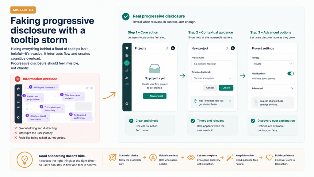
The signup wall is the first place you can lose a user. Not because asking for information is wrong — you need data to personalize and improve the experience — but because there’s a massive difference between what you need right now and what you’d like to have.
I’ve audited signup flows that ask for: name, email, phone number, company name, company size, job title, use case, how they heard about you, and a profile photo — before the user has seen a single pixel of the actual product. That’s not onboarding, it’s a job application.
The cognitive and emotional cost of this is real. Every field is a tiny friction. Every question is a tiny moment of doubt: “Is this worth it? Do I want to give this?” Stack enough of those moments before any value has been delivered and users simply bail.
The rule: you’ve earned the right to ask for information in proportion to the value you’ve already delivered. In the first 60 seconds of someone’s experience with your product, that proportion is basically zero.
The rule: you’ve earned the right to ask for information in proportion to the value you’ve already delivered. In the first 60 seconds of someone’s experience with your product, that proportion is basically zero.
 What to do instead
Audit your signup flow and ask: “What is the minimum we need to get someone to their first meaningful action?” Cut everything else. Move it to profile completion prompts later, when users have already experienced value and are more likely to engage.
On Ask a Favor, we stripped the initial signup to just name and email. Everything else — profile photo, bio, location — we collect progressively, at the moment it’s actually relevant. The result: better completion rates and users who actually fill things in because they understand why it matters.
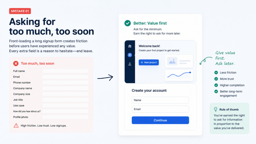
The product tour is one of UX design’s most persistent antipatterns. You know the one: a series of tooltips that walk you through the interface feature by feature. “This is your dashboard. This is where you create projects. This button saves your work.”
Nobody reads these. Or rather — people close them immediately, then don’t remember anything they saw, then get confused when they actually need to use the product.
The problem isn’t the format (though the format is bad). The problem is the conceptual approach: product tours teach people about the tool, when what users actually need is to experience the value.
Slack understood this early. Their onboarding doesn’t explain what channels are. Instead, it asks: “What’s your team working on?” and immediately creates channels from your answer. You’re in a working Slack workspace before you’ve had time to think about whether you understood the tutorial.
The “aha moment” is the specific instant when a new user first understands why your product is valuable to them specifically. Everything in onboarding should point toward that moment as quickly as possible.
The “aha moment” is the specific instant when a new user first understands why your product is valuable to them specifically. Everything in onboarding should point toward that moment as quickly as possible.
For Spotify, it’s hearing your first Discover Weekly playlist — the realization that the algorithm actually gets your taste. For Airbnb, it’s finding a perfect apartment in a city you’re about to visit for a price that seems impossible. For Notion, it’s when you build your first interconnected database and feel the power of the block system.
 How to find your aha moment
Talk to your most engaged users. Ask: “When did you first feel like this was going to become an essential part of your life?” The answer — specific, often surprising — is your aha moment. Now reverse-engineer the onboarding to reach it faster.
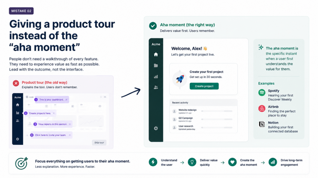
A new user creates their account, gets through signup, and lands on… a completely empty dashboard. No data. No content. No context. Just a blank screen with a faint “Get started” button in the corner.
The empty state — that moment before a user has generated any content or data — is one of the most underdesigned surfaces in most products. It’s treated as a placeholder, a temporary state that will be replaced by real content soon enough. But for new users, this blank screen is their entire first impression of the product.
A well-designed empty state does three things: it explains what will be here once the user takes action, it tells them exactly what action to take, and it makes them feel excited rather than lost. 
Notion does this brilliantly. A new workspace comes pre-populated with templates, sample pages, and a “Getting Started” guide that’s itself built in Notion — so your first act of exploration is also your first lesson in the product’s capabilities.
The blank canvas problem: most creative and productivity tools are most powerful when full of content. But new users see them at their worst — empty, inert, full of potential that they can’t yet visualize. The empty state is your job to fill.
The blank canvas problem: most creative and productivity tools are most powerful when full of content. But new users see them at their worst — empty, inert, full of potential that they can’t yet visualize. The empty state is your job to fill.
What to do instead
Design your empty state as a first-class screen, not an afterthought. Include: a clear illustration or icon, a one-line explanation of what belongs here, a primary CTA that’s specific (“Post your first favor” not “Get started”), and optionally some example/dummy content to make the value tangible.
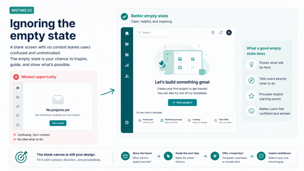
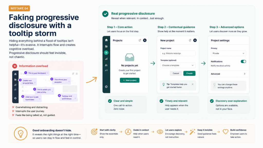
Progressive disclosure is a real, legitimate UX pattern — the idea that you reveal complexity gradually, only as users need it, rather than all at once. It’s the right instinct.
But there’s a common misapplication that I call the tooltip storm: bombarding users with contextual tooltip hints the moment they click anything, flooding the interface with “?” icons, and adding “Need help?” bubbles that follow you around the screen.
This doesn’t feel like progressive disclosure. It feels like surveillance.
Real progressive disclosure means structuring the product itself so that advanced features stay hidden until users have mastered the basics — not sprinkling help text over a product that’s fundamentally too complex for where the user is right now.
Figma does this well. The toolbar shows you the essentials. Right-click menus reveal more. Advanced component settings only appear once you select an element that has them. You feel guided without feeling hovered over.
Ask yourself: am I using tooltips and inline help to explain a product that’s too complex, or to progressively reveal depth that users are ready to explore? If it’s the former, the problem isn’t the help text — it’s the product’s complexity architecture.
Ask yourself: am I using tooltips and inline help to explain a product that’s too complex, or to progressively reveal depth that users are ready to explore? If it’s the former, the problem isn’t the help text — it’s the product’s complexity architecture.
A practical test
Remove all your onboarding tooltips temporarily and watch five new users try the product. Where do they get genuinely stuck? Those are the places that need design changes, not more tooltip text.
This is the one that hurts the most, because it’s entirely avoidable.
Most product teams have a general sense that “onboarding could be better.” Some users complain. Conversion from signup to active user is lower than they’d like. But without granular, step-level data on where users drop off, every improvement is essentially a guess.
You can’t fix what you can’t see.
I’ve worked with teams that spent months redesigning their onboarding flow based on what felt wrong, only to discover after shipping that the actual drop-off point was one email verification step — something they’d barely touched. Six months of work, because they were solving the wrong problem.
The fix is straightforward: instrument every step of your onboarding flow. Not page views — events. “Signup form submitted.” “Email verified.” “Profile photo uploaded.” “First project created.” “First collaborator invited.” Track each one, calculate conversion between each pair, and you’ll have a very clear picture of where users are leaving.
Bonus: once you have event tracking in place, you can also identify which onboarding paths correlate with long-term retention. Users who complete action X in the first 48 hours might retain at 3x the rate of those who don’t — that’s your highest-leverage intervention.
Bonus: once you have event tracking in place, you can also identify which onboarding paths correlate with long-term retention. Users who complete action X in the first 48 hours might retain at 3x the rate of those who don’t — that’s your highest-leverage intervention.
Tools worth knowing
Mixpanel and Amplitude both do funnel analysis well. PostHog is a great open-source alternative if you want data sovereignty. Even Google Analytics 4’s event tracking is better than nothing. Start with three or four key events per onboarding stage — don’t try to track everything at once.