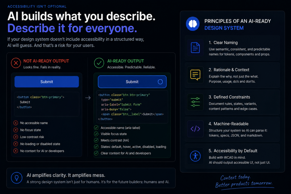
Most design systems use token names like Blue-500 or Primary — which communicate colour value but not purpose. A human designer understands that “Primary” means “call-to-action button”. An AI agent doesn’t.
 Example: When GitHub Copilot generates a button component, it looks for semantic context — “action”, “destructive”, “neutral” — not colour codes. A token named color-interactive-primary-default is actionable; Blue-500 is not.
Case Study: Salesforce Lightning Design System uses a three-tier token architecture: global → alias → component. Alias tokens like color-action-hover are exactly what AI needs to make contextual decisions without additional instructions.
 Impact on Designers:
- Rename tokens to describe intent and state, not just visual properties.
- Audit your token library for purely descriptive names — rename them systematically.
- Establish a naming convention before AI tooling is introduced: retrofitting is significantly harder than building right the first time.
 Further Reading: Adobe Spectrum — Design Tokens | Salesforce Lightning Design Tokens

Design systems typically show what to use. AI agents need to know when and why. A component gallery with no decision logic is a vocabulary with no grammar.
Example: A modal dialog component can be used for confirmations, warnings, or input flows — but the choice depends on context and user state. Without documented rules, an AI generating UI will pick the wrong one every time.
Case Study: IBM Carbon Design System documents not only usage guidelines, but explicit “when to use / when not to use” rules for every component. This structured decision logic reduces AI-generated misuse in integrated development environments by making the right choice machine-parseable.
Impact on Designers:
- Every component needs a decision tree, not just a visual demo.
- Think of documentation as training data — the clearer the rules, the more accurate the AI output.
- Consider adding a structured
usage.jsonalongside each component with machine-readable constraints.
Further Reading: IBM Carbon — Modal Usage Guidelines

AI agents explore every possible combination of a component’s variants. Without explicit constraints on what is valid, they will combine states that designers never intended to coexist — disabled + loading + error + success, expanded + collapsed simultaneously.
Example: A form input component with states for default, focused, error, disabled, and read-only generates 120+ theoretical combinations. Without constraint documentation, AI will generate all of them. With it, only valid state trees are possible.
Case Study: Google Material Design 3 introduced “state layers” — a systematic model for valid state combinations — precisely to give automated tools a clear ruleset, not just a set of options. This was explicitly designed with AI tooling in mind.
Impact on Designers:
- Define valid state combinations explicitly in component specs, not just in design files.
- Use structured formats (JSON or YAML constraint files) alongside visual documentation.
- Build a “forbidden combinations” list — what states must never coexist.
Further Reading: Material Design 3 — States Overview

AI agents don’t infer accessibility requirements from visual design. They need pre-computed accessibility metadata embedded in the design system itself — ARIA roles, keyboard interaction patterns, focus management rules, contrast ratios.
Example: A dropdown component needs to tell AI: this uses role="listbox", it traps focus, it responds to arrow keys and Escape, it announces the selected option to screen readers. Without this, AI generates inaccessible dropdowns by default.
Case Study: Microsoft Fluent UI stores accessibility metadata directly in component JSON schemas, enabling GitHub Copilot and other agents to generate accessible components by default without additional instructions from the developer. This is the future of accessible-by-default AI output.
Impact on Designers:
- Move accessibility guidelines from prose documentation into structured, machine-readable formats.
- Design systems that embed accessibility metadata produce AI output that passes automated audits from the first generation.
- Partner with your accessibility team to document ARIA patterns at component level.
Further Reading: Nielsen Norman Group — AI and Accessibility | Microsoft Fluent 2 Design System
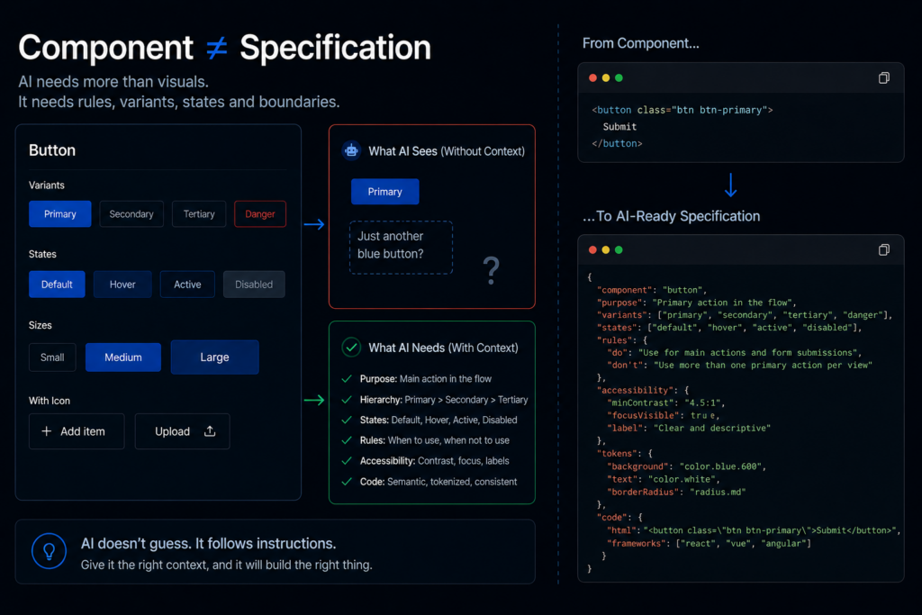
AI agents don’t read Figma. They consume code, structured specifications, and APIs. A design system that exists only as a Figma library — however well-organised — is invisible to most AI-powered development tools.
Example: A component defined in Figma with Auto Layout and well-named layers still requires a developer to manually translate it into code. An AI agent cannot read the Figma file and generate production-ready components without a coded reference.
Case Study: Shopify Polaris publishes every component as both a Figma library and a fully documented React component with a JSON API schema. AI-powered tools in the Shopify ecosystem consume the JSON spec directly — not the visual file — to generate storefront components that match the design system perfectly.
Impact on Designers:
- Design system teams need to publish coded component libraries alongside Figma files — both are now first-class deliverables.
- Invest in a design token specification (the W3C Design Tokens format is the emerging standard) that AI tools can consume directly.
- Think of your design system as an API, not a gallery.
Further Reading: Shopify Polaris | Brad Frost — A Design System That AI Can Use